This section helps you understand the charts and tables that summarize the results of a particular group's practice exam results.
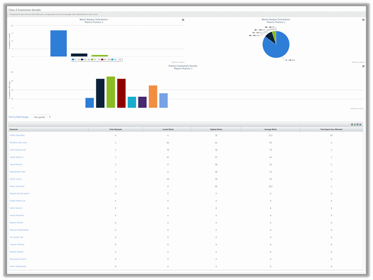
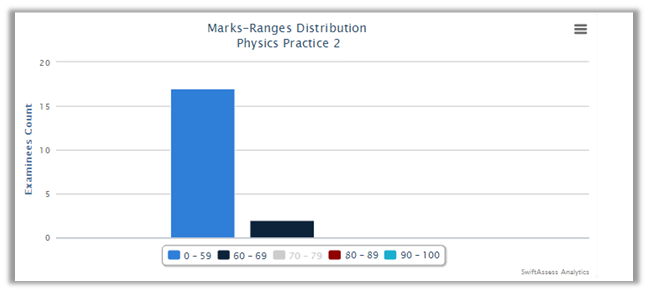
Marks-Ranges Distribution Charts
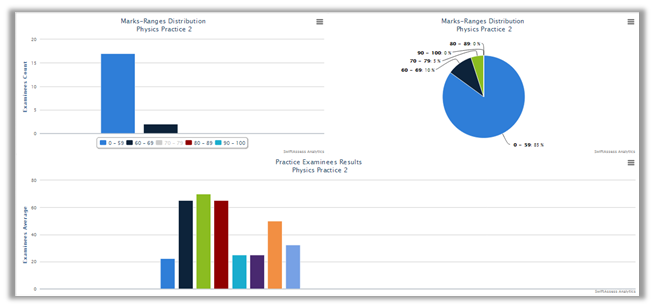
•The marks ranges are distributed and represented in two types of charts; pie chart, and bar chart.
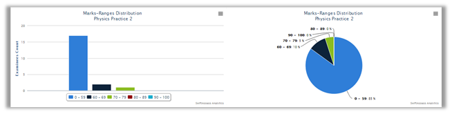
•Each chart shows how many examinees scored a particular range. The following image shows an example....
oFor the bar chart, you can click on the legend to hide/show a certain range.
![]()
For example, if you click on the ![]() , the green bar will disappear from the chart.
, the green bar will disappear from the chart.
oClick on it again to make the black bar reappear.
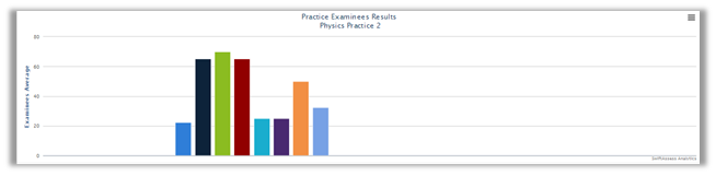
•The bottom char shows the average for each examinee in the group.
•All of the charts can be printed, exported as an image (PNG/JPEG), PDF document, and SVG vector image by clicking on ![]()
Marks Ranges Distribution Table
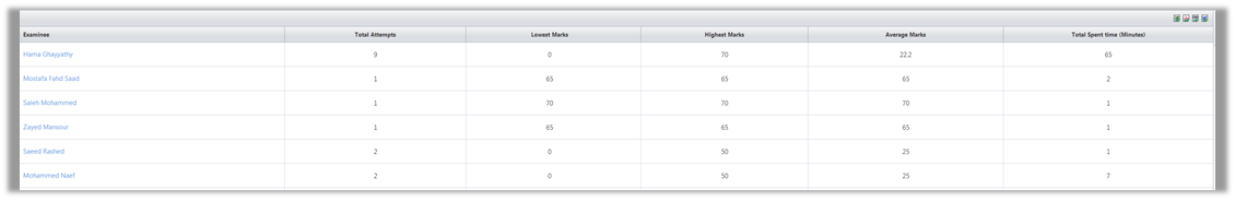
•The table contains the following headers:
o"Examinee"
o"Total Attempts"
o"Lowest Marks"
o"Highest Marks"
o"Average Marks"
o"Total Spent Time (Minutes)"
•The table can be exported to Excel, PDF, CSV, and Word.
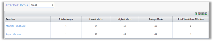
•Choose a range of marks to filter the results in the table.
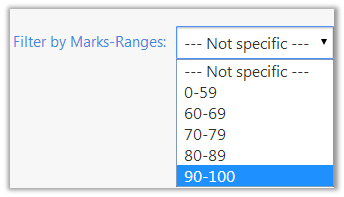
•Now the table will show only the results that you have specified.
oFor example, if you choose 90-100, only the examinees who scored in that range will appear in the table.
•Click on the examinee's name to view his/her results, as in the "Review Examinee Results" report.
See Also
SwiftAssess © 2021